Using Heat Map Background Colors
Overview
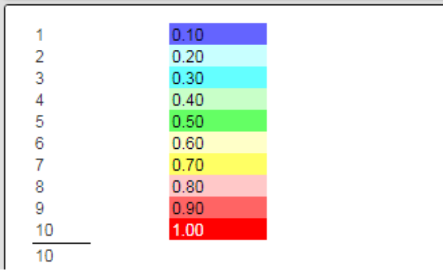
Heat map colors enable visual comparative feedback for a set of values. A simple example is shown below for a numeric sequence 1 to 10.
A relevant study “The Psychology of Color in Data Visualization for Business Intelligence“ is at https://uxpilot.ai/blogs/color-psychology-data-visualization-business.
This simple example was created using a main filter of

The layout cells are shown below.

This example is located at “example/Formatting/Heat map colors - 2 pass”.
Template Example
This example is located at “example/Macro functions/Matrix Quarterly Sum Report with heat map”.
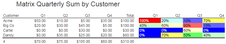
Consider the analysis result below

We can use a heat map color scheme to highlight the values relative to the maximum quarterly value.
The layout cells are broadly described as shown below.

We set our maximum quarterly value to 0 on the group header line.
The body cells are summarized below.
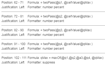
On the first pass the cells obtain the quarterly value. We use the twoPass macro function to achieve our end goal.
We also determine the maximum quarterly value during processing.
On the second pass each quarterly value is compared with the maximum value.
The heat map quarterly cells have the following properties to affect their foreground and background colors.


The effects are the cell values and colors as shown above.
Switching the Color Sequence
Here is an updated set of body cells.

The default low to high color range is blue to red. To switch it to red through blue add the fourth argument “true” as shown below for the rightmost cell on the line.

The results are shown below.

More information on using matrix analytic techniques in Qarbine can be found in the “Matrix Analysis” guide.